Categories
news

www.cut 3.3

Third time lucky as they say. I had this update ready to go last September, shortly after iOS 8 launched but Apple rejected it. With a few visual tweaks to make the reviewers happy and a few other functional changes. www.cut 3.3 should now be available on the App Store.

The one line summary: this is the iOS 8 update for www.cut. I’ve made a few small tweaks to the UI but the most visible change is the addition of an extension so you don’t need to mess with the URL scheme.

www.cut Shorten action
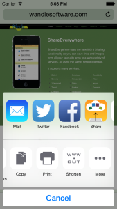
Here’s how you would use the extension in Safari:

  • Tap the “Action” menu, the one when you can share to Facebook or save to your reading list
  • On the bottom row, scroll to the right
  • Tap “More”
  • In the list find “Shorten” and switch it on
  • Tap “Done”
  • Tap the now-visible “Shorten” button
  • Tap “Done”

Steps two to five only need to be done once.

(And yeah, that should be a numbered list. My WordPress template seems to have gone crazy and replaced the numbers with letters…)

Internally I’ve updated to a newer version of the Bit.ly API. Existing users will have to log in again, this time using their username and password rather than going through the palaver of finding their API key. I’ve also taken the opportunity to modernise some of the code, though no Swift just yet!

It’s available on the App Store now.

Categories
news

Coming soon: Rootn Tootn 2.0

I have just submitted a new version of Rootn Tootn to Apple for review. Due to the Christmas holidays the update won’t make it onto your phone until next year but I thought it was worth letting you know what’s coming!

Rootn Tootn 2.0 - Statistics Screen
Rootn Tootn 2.0 – Statistics Screen

It started out as a quick and simple update mostly to bring it in line for iOS 7 but it ended up being a lot more than that.

In terms of its aesthetics, it was already pretty close to being ready — since it already contained a lot of translucency — but I wanted to make it a good citizen and really make it fit in. To the left you can see what the new timer statistics screen looks like.

Now the toolbars and navigation bars use the new iOS 7-style semi-translucent look and the timers have an enhanced blur effect. I also increased the contrast between the background and the text making it easier to see all your details even when very dark images.

To make the app easier and faster to use I moved around some of the screens. In general, things that are used often are emphasised and the order of information is more logical. A simple example is the statistics screen which now has a drill down to the underlying data (rather than being at the same level).

Along the same lines are a few helpful shortcuts. The one you’ll likely use the most is tapping and holding the button to stop a timer brings you directly to the notes screen. This means you can add a comment without having to first go through the “history” screen. I always find that it’s these small details that make all the difference.

It will be a free update for all existing users.

I’ll release more details shortly before launch. Stay tuned!