I discussed the new bookmark view yesterday. Today I’d like to talk about the new editing view.
In the past I’ve heard a few complaints about this screen. Firstly, the navigation was a little… quirky. Secondly, there just wasn’t enough space to add as many tags as people wanted. Thirdly, you had to type in all the tags. A few versions ago I added a way to pick from your existing tags and, while most people agreed that it was useful, many wished for something more like in the Mail app. And finally, I got complaints that you had to manually enter the bookmark title.
In Yummy 2.6 I present a completely new editing screen.
I think it’s fair to say that all these suggestions have been addressed.
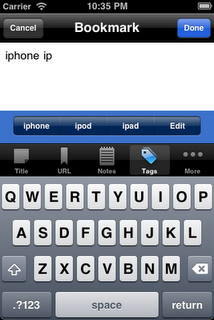
Rather than try to squeeze everything onto one screen as happened with the previous version, Yummy 2.6 now places each of the major fields in separate tabs. This leaves plenty of space to enter your notes, tags and a title.
It also allowed me to address the other requests. For a long time it’s been possible to get Yummy to find the title of a web page, but a number of people never found it. The extra space means that there’s a big button above the tab bar and below the text box.
For entering tags, as you can see in the screen shot, Yummy will suggest the top four tags starting with the letters you’ve started typing. When there are three or fewer suggestions, the right-most button takes you to the edit screen, much as it did in the previous versions. One “glitch” you may notice is that long tags flow over the bounds of each button. This does, I’ll concede, look a little messy but by truncating each tag it would make it difficult to distinguish between some longer words. I felt that being useful trumped being pretty.


