Deprecated: Hook custom_css_loaded is deprecated since version jetpack-13.5! Use WordPress Custom CSS instead. Jetpack no longer supports Custom CSS. Read the WordPress.org documentation to learn how to apply custom styles to your site: https://wordpress.org/documentation/article/styles-overview/#applying-custom-css in /home/yjs2s4c823i9/additional_domains/wandlesoftware.com/public_html/wp-includes/functions.php on line 6085
faq – Wandle Software
Categories
faq

Why you would need a reminder to feed a baby? Don’t they let you know?

A few people have asked the following question, so I thought it was worth discussing in more detail here:

Why you would need a reminder to feed a baby? Don’t they let you know?
There are two simple answers to that:

  • Crying is a late sign of hunger. Hopefully you’ll know that they need feeding before that. However, especially in the first few weeks, you won’t be in a position to know what the other signs are either because you’re new to the whole thing or because you’re exhausted!
  • In the first few weeks the midwives are very keen that you feed every couple of hours and with everything else going — so much that’s new, so little sleep — you may find it easy to lose track of time

There are other reasons too:

  • You might find that a reminder is a good way to get into a regular routine
  • You don’t even need to use the timers to remind you to feed your baby. The reminders can be for anything. Nappy change. Medication. Whatever you want and whatever makes sense
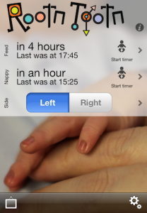
  • Even if you switch the reminders off, you can see at a glance when the last feed was and approximately when the next one is likely to be. Of course you can do this in your head, but why would you?

Even if you’re still not convinced, reminders are only half of the “baby feed timer and reminders” description used on the App Store. Rootn Tootn also records all your feeds, changes and anything else that you want. Suffice it to say that that log of events could be enough reason to use the app, even without the reminders!

Categories
faq

About Rootn Tootn

The last time I released a new app was 2009. I’ve been busy, there have been plenty of updates since then, but a completely new, version 1.0 app is something special. Since that last release, the App Store has grown enormously. Just about every imaginable category has a number of competing app so I think it’s important to explain where Rootn Tootn, our new baby feed timer and reminder app, fits in and why you should consider buying it instead of one of its more established competitors.

After looking around the app store, I think you can put most competitors into one of two categories.

The first is what I’ll label “all-encompassing apps.” They record every last detail about your baby. Measurements for everything, eye colour, height, weight, inoculations, diaries, and… and… oh, and reminders.

Well, it all sounds great in principle but are you ever actually going to enter any of that information? Don’t all those extra options get in the way of the information that you really need?

So the guiding principle of Rootn Tootn is simplicity. You really only ever have to press a single button: to start the timer. It’s been designed to require as little of your time as possible. Let’s face it, time is at a premium, especially straight after birth.

Later I searched for a different term and came up with a bunch of other apps. They were very simple, had “baby” colours and confusing UIs.

I don’t believe that being a parent means you have to surrender to the cliches of pinks and blues, of cutsie clipart and baby language.

Rootn Tootn allows you to put your own pictures in the background and overlays your timers. Simple and clean. Honestly, would you rather see some clipart or a photograph of your own baby?

The confusing UIs were puzzling. Many are limited. Want a timer for anything other than feeding? Sorry. Have two babies, both on slightly different schedules? Nope.

In Rootn Tootn I think the simplicity belies a surprising depth. You can have as many timers as you like; you can have custom reminders; you can record the details (or not); you can add notes (or not); activities can have a duration (feeding) or just a frequency (changing a nappy/diaper).

So, back to the question posed in the first paragraph: why you should consider Rootn Tootn instead of one of its more established competitors? I think it offers a great balance between simplicity and features that you’ll actually use. It saves you time, it’s easy to use and it looks great. What more could you want?

Categories
faq support

502

If you’re using Delicious and you’re seeing a lot of 502 errors… you’re not alone.

The good news is that they’re mostly benign. Just press refresh and it usually works just fine.

Since I never saw these errors before AVOS took over and because I see them on the website itself, I am pretty confident that it is not a problem in Yummy. If I find a way to avoid exposing these errors to you I will, of course, provide an update.

Categories
faq news support

Yummy and iOS5

I’ve been running the iOS 5 beta’s since late July and have not seen any major problems in all that time, so I think you’re unlikely to have any problems. Of course, please let me know if you do see anything untoward.

Having said that, Yummy does not have any iOS 5 exclusive features. It still uses its inbuilt Twitter client rather than the one built into iOS; there’s no iCloud support or any of the other nice and shiny new stuff.

Categories
faq news

Yummy 2.6.2

I have just submitted a new version of Yummy to Apple. Although a comparatively small update it’s an important one:

  • Support for syncing with the New Delicious.com
  • Removal of the Yahoo! ID authentication method
  • Minor branding updates (now Wandle Software)
  • Other minor bug fixes

Apple say that they’re approving over 90% of updates within seven days, so… fingers crossed.

Categories
faq news

Bye-bye Yahoo! ID

With the transfer of ownership from Yahoo! to AVOS, a number of changes have taken place. If you use the website you’ll see that the “look and feel” has changed.

The other main user-facing change is that you can no longer use your Yahoo! ID to log in — which makes sense since it’s no longer owned by Yahoo!

So if you already own Yummy, you’ll need to log out and then back in again with the username that you created when you agreed to transfer over to AVOS.

If you’ve just bought Yummy, then please do not select the Yahoo! ID option when logging in for the first time. It won’t work and you’ll get some weird error messages!

The new version of Yummy that I will be submitting shortly will make this easier.

Categories
faq howto news support

Yummy 2.6: Bookmark editing

I discussed the new bookmark view yesterday. Today I’d like to talk about the new editing view.

In the past I’ve heard a few complaints about this screen. Firstly, the navigation was a little… quirky. Secondly, there just wasn’t enough space to add as many tags as people wanted. Thirdly, you had to type in all the tags. A few versions ago I added a way to pick from your existing tags and, while most people agreed that it was useful, many wished for something more like in the Mail app. And finally, I got complaints that you had to manually enter the bookmark title.

In Yummy 2.6 I present a completely new editing screen.

I think it’s fair to say that all these suggestions have been addressed.
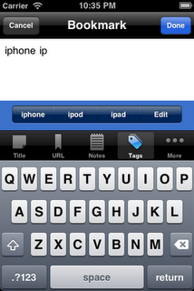
Rather than try to squeeze everything onto one screen as happened with the previous version, Yummy 2.6 now places each of the major fields in separate tabs. This leaves plenty of space to enter your notes, tags and a title.
It also allowed me to address the other requests. For a long time it’s been possible to get Yummy to find the title of a web page, but a number of people never found it. The extra space means that there’s a big button above the tab bar and below the text box.
For entering tags, as you can see in the screen shot, Yummy will suggest the top four tags starting with the letters you’ve started typing. When there are three or fewer suggestions, the right-most button takes you to the edit screen, much as it did in the previous versions. One “glitch” you may notice is that long tags flow over the bounds of each button. This does, I’ll concede, look a little messy but by truncating each tag it would make it difficult to distinguish between some longer words. I felt that being useful trumped being pretty.
Categories
faq news

Yummy 2.6: Bookmark view

The bookmark view is one of the most used in Yummy and yet it has barely changed since version 1.0. I thought it was about time that changed since there were a number of things that have always bugged me about it.

Here’s how it looks in Yummy 2.6.

Key improvements are that you can see the full title and all your tags, no matter how long the title is and no matter how many tags you have. (I left the URL truncated if too long as I didn’t think that was that terribly important. Let me know if you’d always like to see the full line.)

A small point maybe, but I think it’s much more attractive than the old version, too.

Paired with this new bookmark view is the new editing view. I’ll talk about that a little more tomorrow.

Categories
faq howto news

Yummy 2.6: List View

On the iPhone you are very much limited by screen space. You can’t always see the full bookmark name. There’s not really enough space to show the name, the URL, the tags and the description. And worse, for me, the last solution I had to this wasn’t popular. I thought scrolling the titles was a neat way around this limitation; I think I was about the only person who liked it.

Trying to take all of this on board, Yummy 2.6 changes the list view to look like this:

If you want to see the full title, simply press and hold. The title will be shown just above your finger or at the very bottom of the screen if it won’t fit above it. (There’s another blog post coming to explain why I did it this way.)

By default, Yummy still displays the URL below the title. If you go to the settings you can change this to the tags or notes field. You can also swipe left or right on an individual bookmark in the list to cycle through the three options.

These two features are only available on iOS 3.2 and above.

Categories
faq news support

Logging into Delicious

While Delicious has not gained a huge number of new features over the last few years, it has acquired a wide range of ways to log in.

A couple of years ago, there was a simple username and password.

Then in late 2009, new accounts came with a Yahoo! ID. Yummy was the first, and for a long time only, iPhone client to support the new accounts.

Even more recently, Yahoo! added the option to create a new Delicious account using your Google or Facebook credentials. I didn’t see an announcement for this. Apparently I wasn’t the only one. It seems that their development team didn’t see the notice either.

That’s right. As I type this, there is no way that I can support Delicious accounts with Google and Facebook credentials. I am told that it’s “on the roadmap” but I’ve seen no indication when we might see that or what it might look like.

In summary, it is not possible for any third-party client, including Yummy, to support Google or Facebook credentials when logging into Delicious. Please do not buy a copy of Yummy if this is a requirement for you.